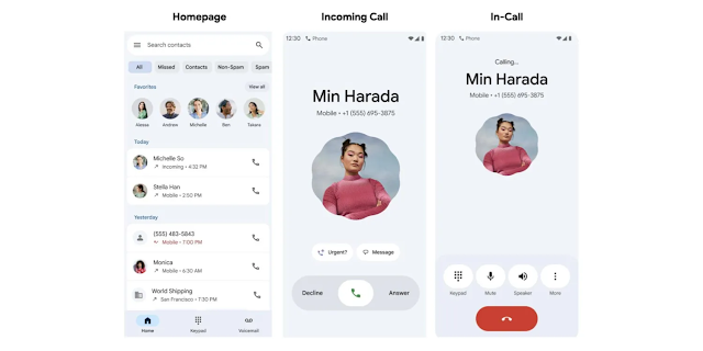
Google Phone Beta Shakes Things Up: Welcome the New Home and Keypad Tabs with a Nav Drawer
The Google Phone app, the default dialer for Pixel devices and a popular choice for many other Android users, is getting a significant user interface overhaul. In the latest beta version, Google is testing a brand-new navigation system, moving away from the familiar top tabs to a modern bottom navigation bar featuring dedicated 'Home' and 'Keypad' tabs, complemented by a classic navigation drawer.
This is more than just a fresh coat of paint; it's a fundamental rethinking of how users interact with the core functions of the Phone app. Let's dial in and explore what this change means for you.
What's New? A Closer Look at the Redesign
For years, the Google Phone app has organized its main sections—Recents, Contacts, and Voicemail—into a set of tabs at the top of the screen. While functional, this design could feel a bit dated and cumbersome for one-handed use on today's larger smartphones.
The new beta update (version 135.0.640356619-publicbeta for those keeping track) completely revamps this structure.
1. The Bottom Navigation Bar: Home & Keypad Take Center Stage
The most prominent change is the introduction of a bottom navigation bar with just two primary tabs:
Home: This new section acts as your central hub. It appears to merge the 'Recents' and 'Contacts' tabs from the old design. Upon opening the app, you'll be greeted by your recent call log. A search bar at the top allows you to quickly find contacts, and a list of your favorite contacts is displayed prominently below the search bar for easy access. This streamlines the experience, putting your most frequent interactions front and center.
Keypad: The dial pad, previously accessible via a floating action button (FAB), now has its own dedicated tab. Tapping on 'Keypad' brings up the dialer instantly. This is a logical move, making the most fundamental feature of a phone app—dialing a number—more explicit and accessible. The floating button is gone, leading to a cleaner, less cluttered interface.
2. The Return of the Navigation Drawer
So, where did 'Contacts', 'Voicemail', and other settings go? They've been neatly tucked away into a navigation drawer, accessible by tapping the hamburger menu icon (three horizontal lines) at the top-left corner of the screen.
From this slide-out menu, you can now access:
Contacts
Call history (a more detailed view than the 'Home' tab)
Voicemail
Blocked numbers
Settings
This move declutters the main screen, reserving the prime real estate on the bottom bar for the two most-used functions while keeping secondary features just a tap and a swipe away.
Before vs. After: A Tale of Two Interfaces
Old Interface (Stable Version) | New Interface (Beta Version) |
Three tabs at the top: Recents, Contacts, Voicemail. | Two tabs at the bottom: Home, Keypad. |
A floating action button (FAB) at the bottom-right to open the keypad. | No FAB. Keypad is a permanent tab on the bottom bar. |
Search bar integrated within the top tab structure. | A prominent search bar at the top of the 'Home' tab. |
Settings accessed via a three-dot menu at the top-right. | Settings, Contacts, Voicemail, etc., moved to a navigation drawer. |
Why This Change? The Benefits of the New UI
This redesign isn't just for aesthetics. It brings several practical advantages:
Improved One-Handed Use: Placing the main navigation controls at the bottom of the screen makes them much easier to reach with your thumb, a crucial improvement for modern, large-screen phones.
Cleaner, More Focused Interface: By moving less-frequently used items to a navigation drawer, the main screen feels less cluttered. The focus is squarely on making calls and viewing your recent activity.
Alignment with Modern Android Design: This change brings the Phone app in line with other Google apps like Gmail, Photos, and the Play Store, which have long used bottom navigation bars. It creates a more consistent user experience across the Android ecosystem and aligns perfectly with Google's Material You design language.
How to Get the New Google Phone UI
Eager to try it out for yourself? This new design is currently rolling out to users enrolled in the Google Phone app's beta program.
Here’s how you can join:
Open the Google Play Store on your Android device.
Search for the "Phone by Google" app.
On the app's listing page, scroll down until you see the "Join the beta" section.
Tap "Join" and confirm.
Wait a few minutes for the process to complete. You will then receive an update for the app which should bring you to the beta version.
Keep in mind that beta software can sometimes have bugs. The rollout is also server-side, meaning that even if you're on the correct beta version, you might not see the new UI immediately. It may take a few hours or days to appear.
The Road Ahead
This is a promising and logical evolution for the Google Phone app. By modernizing its interface and improving its ergonomics, Google is ensuring its dialer remains one of the best options available for Android users.
While it's currently in beta, the positive reception suggests this redesign will likely make its way to the stable version for all users in the coming months. What do you think of the new look? Let us know in the comments below!


